Timeline
10 weeks, Fall 2021
Skills
Figma, UX/UI
City of Easton, PA
Easton has activities welcome to tourists and locals.
It is a town with full of interesting sites to see and history to absorb.
The website is used by many people for information about
entertainment, places of interest, and daily events.
The Problem
The website has an ineffective visual hierarchy, and inconsistent
design and redundant contents that cause users to have trouble
finding what users need on the website.
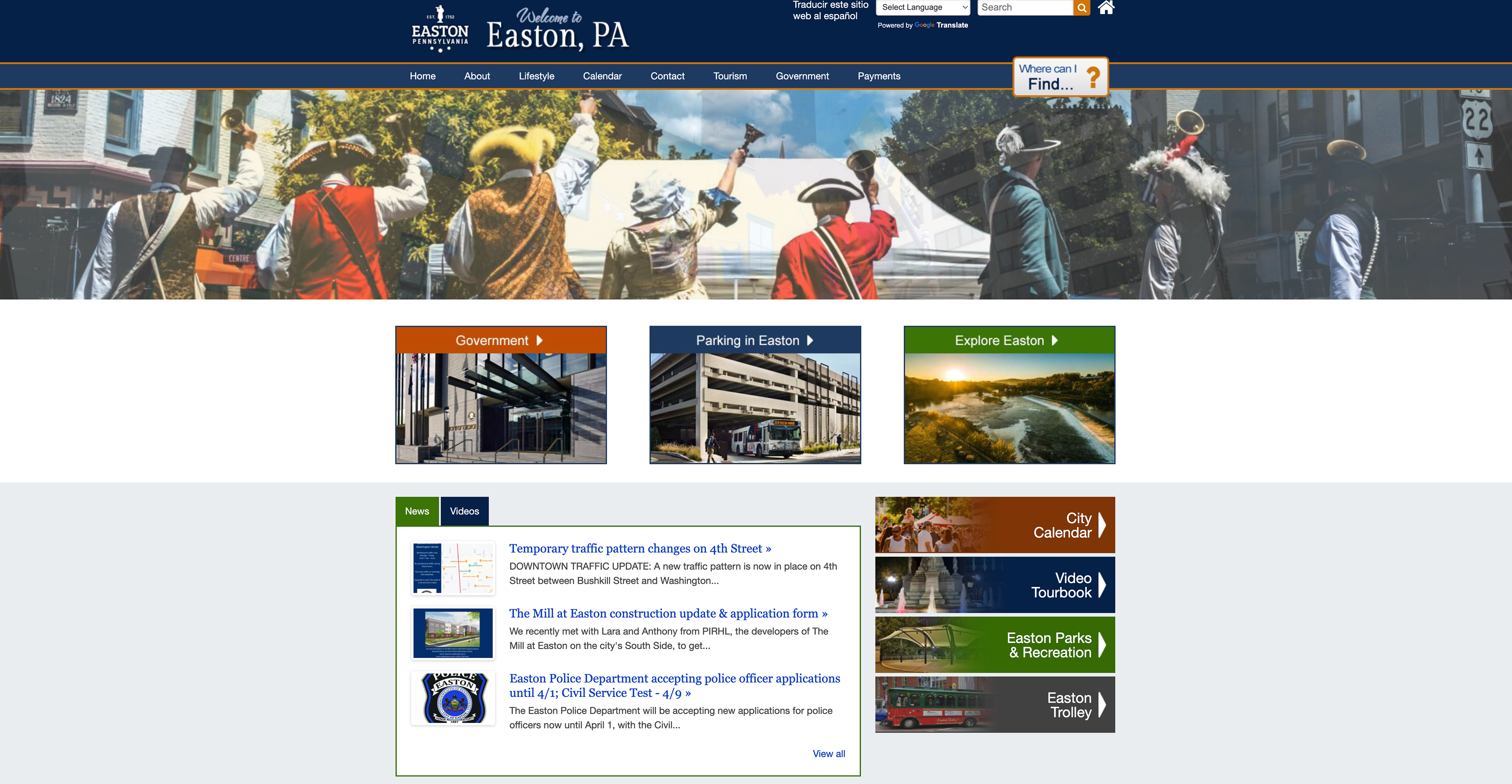
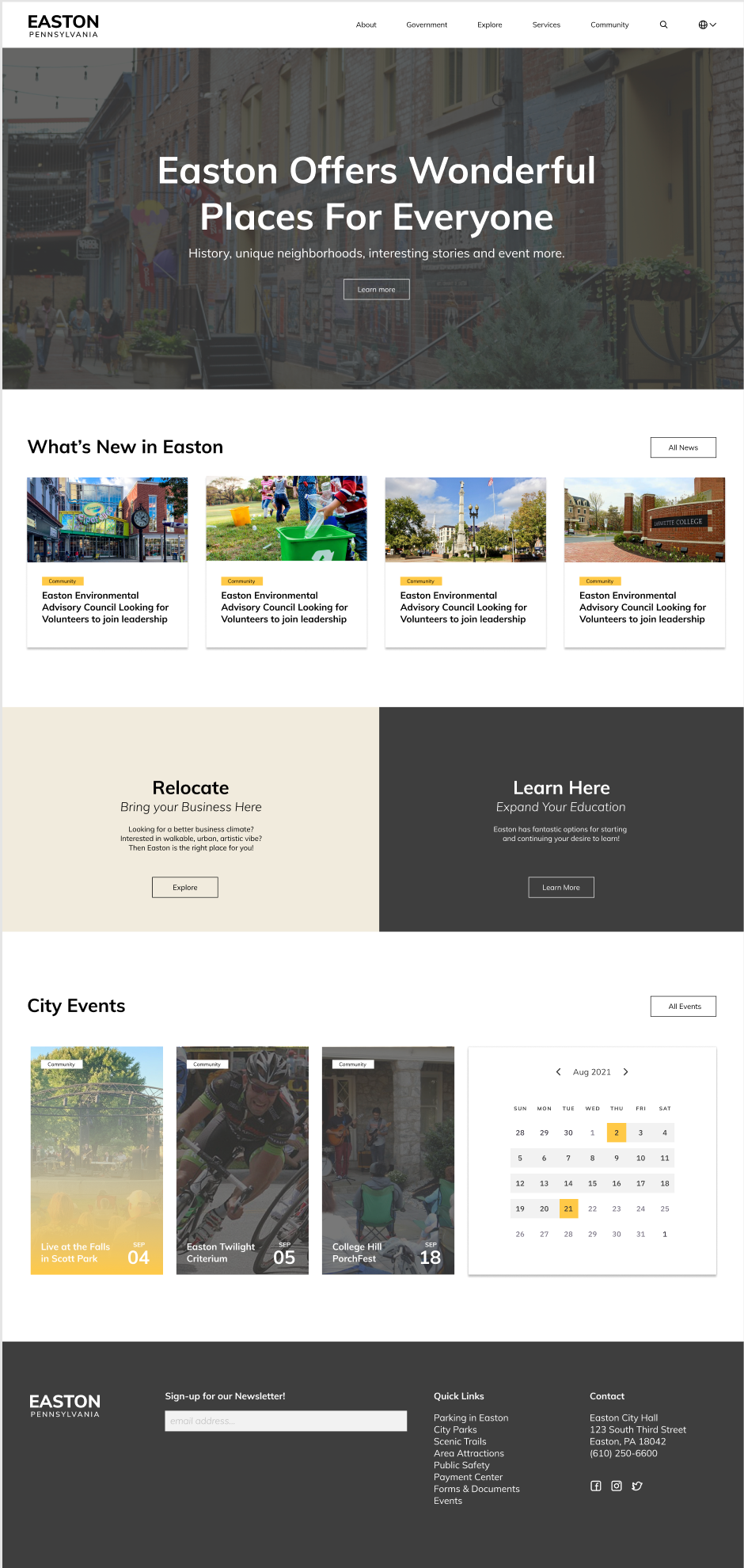
Home Page
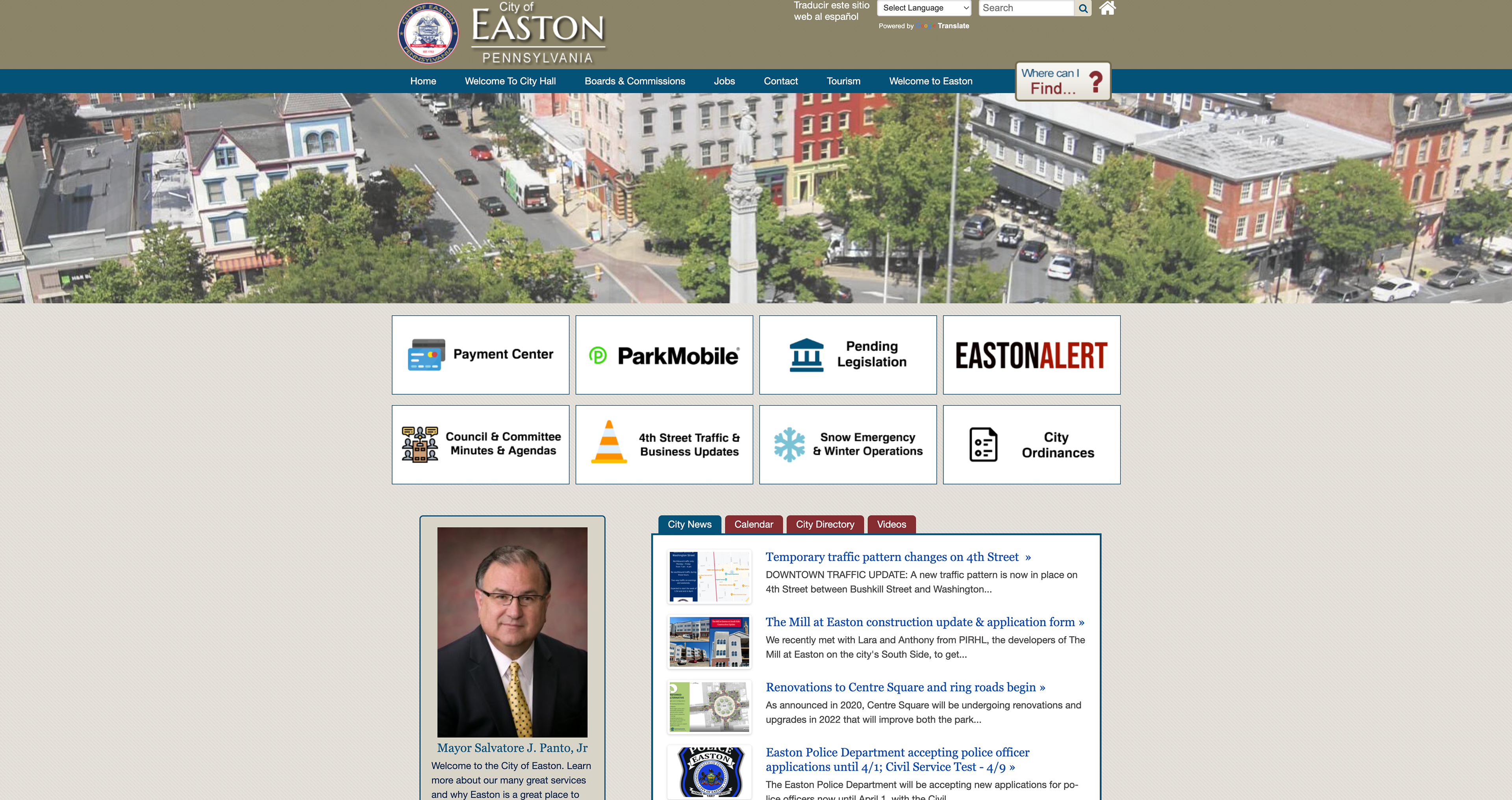
Government Page
Tour Page

Lifestyle Page
Screenshots of the current Easton website pages
Goals
1. Make the website more interactive and appealing.
2. Reorganize the structure of the website to avoid confusion.
3. Improve the overall visual hierarchy for better
accessibility and navigation.
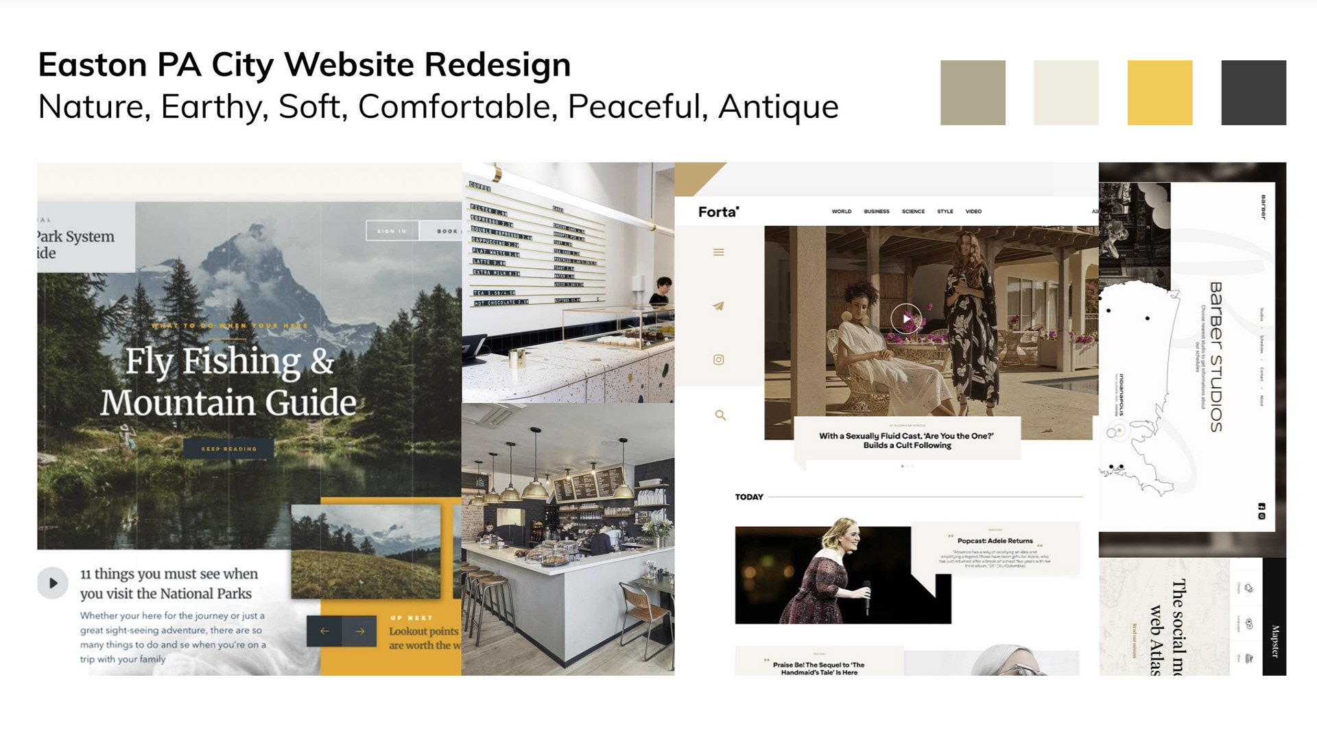
Inspiration Board V1: Coffee Date
The first inspiration board reflects the elegant, modern, and
sophisticated side of the city. I incorporated the neutral color palette,
line patterns, and clean sharp edges to build an aesthetic feel.

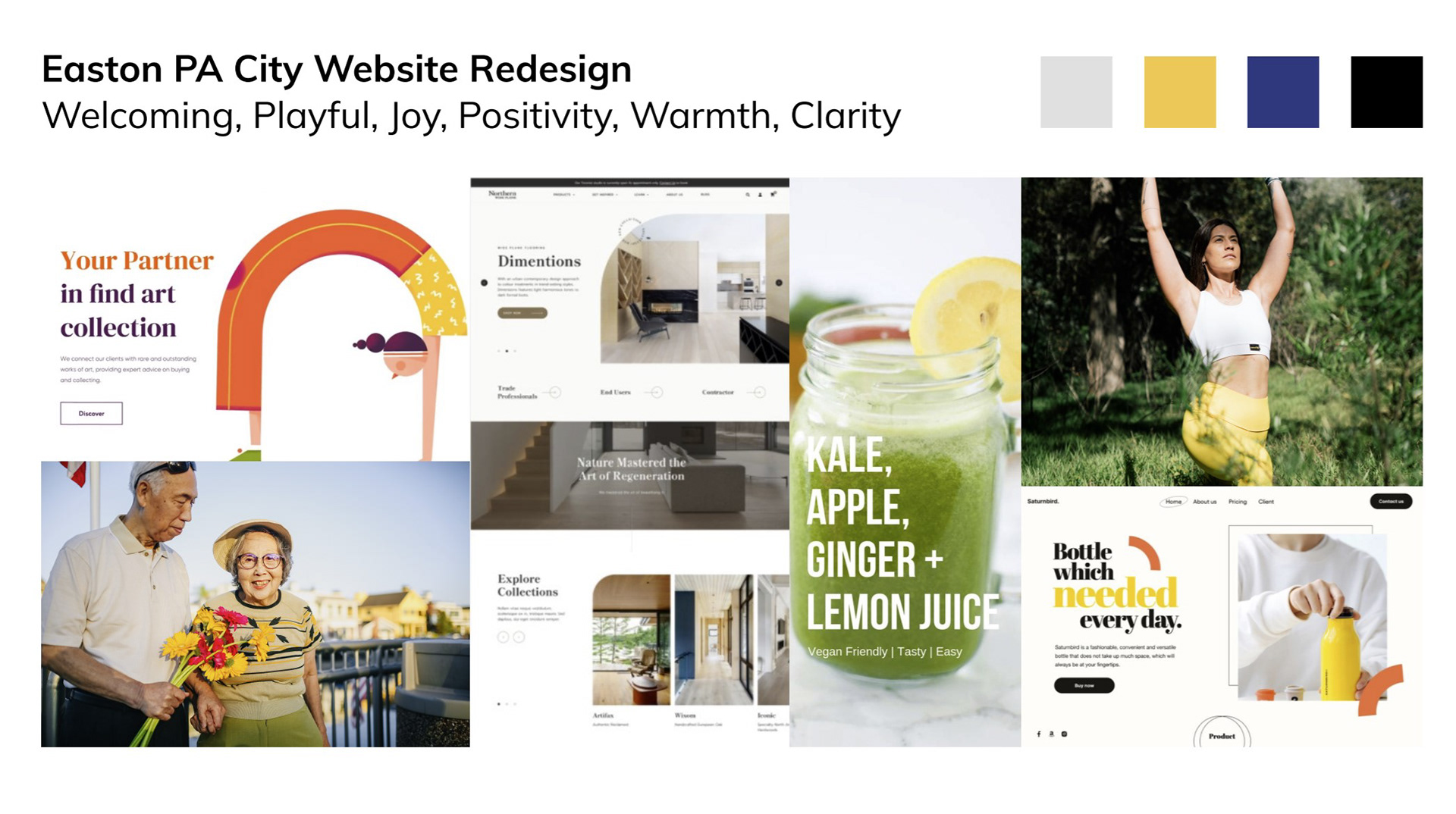
Inspiration Board V2: Optimistic Day
The second inspiration board reflects the energetic, entertaining, and
optimistic side of the city. I incorporated the bright vivid yellow color
as a highlight color, line patterns, and round edges and shapes to
build an enthusiastic, spontaneous, and happy feel.
User Flow
user flow

Iterations & Solutions
iterations and solutions
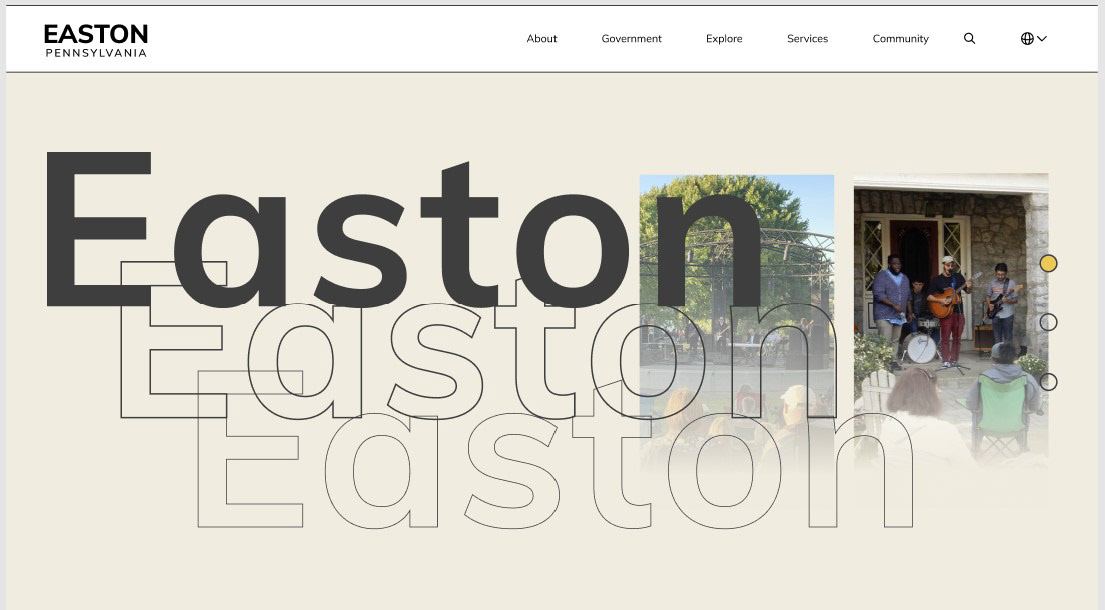
Initial Design for Home Page
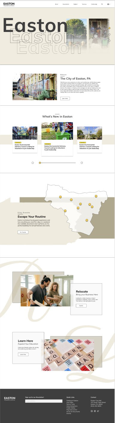
Home Page V2
Home Page V3
The Initial design of home page was working okay. It had the
consistent style and repetitive elements throughout page,
a better visual hierarchy with a clear proximity of contents.
However, the overall design was quite rigid, static, and dingy,
therefore I decided to bring more dynamics to my design.
During developing the second version of home page, I explored
design further and tried to bring depth to it. However, it looked
messy and still dingy and struggled with the sense of unity.
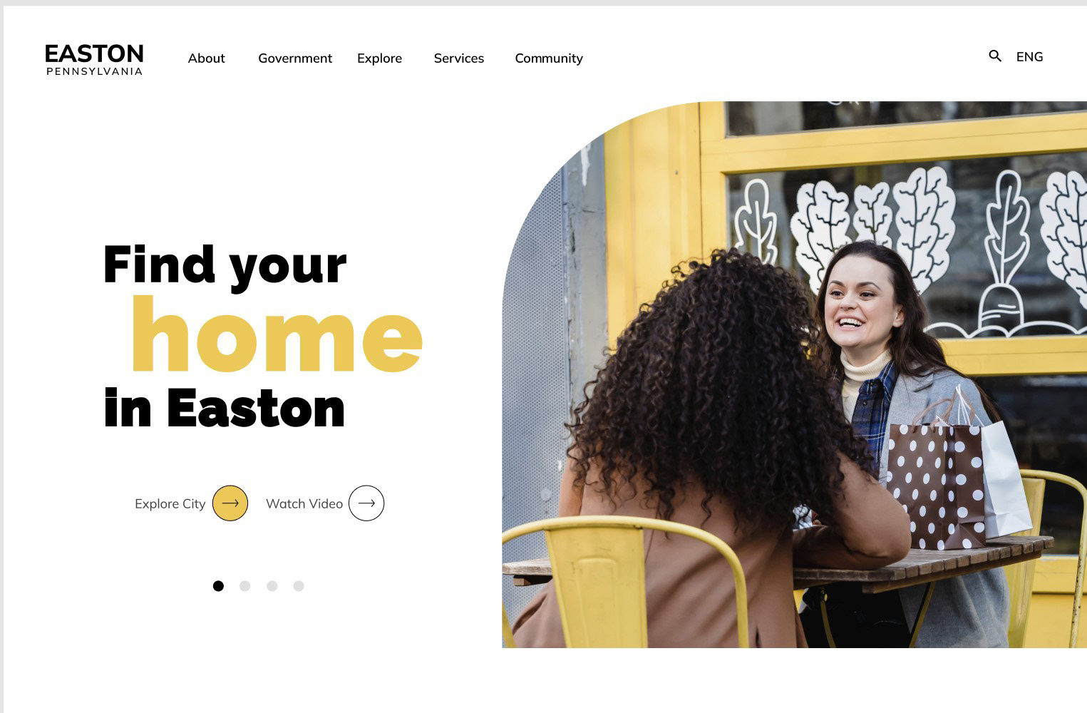
V3 design looked way more organized and close to the design
that I was aiming for: more space to breathe, line work and
layering elements, and clarity of the design. Now, I wanted to
push it more to bring liveliness of the city to the design by
using a solid color palette and implementing dynamic
shapes and another font.
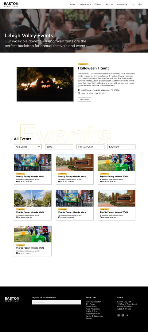
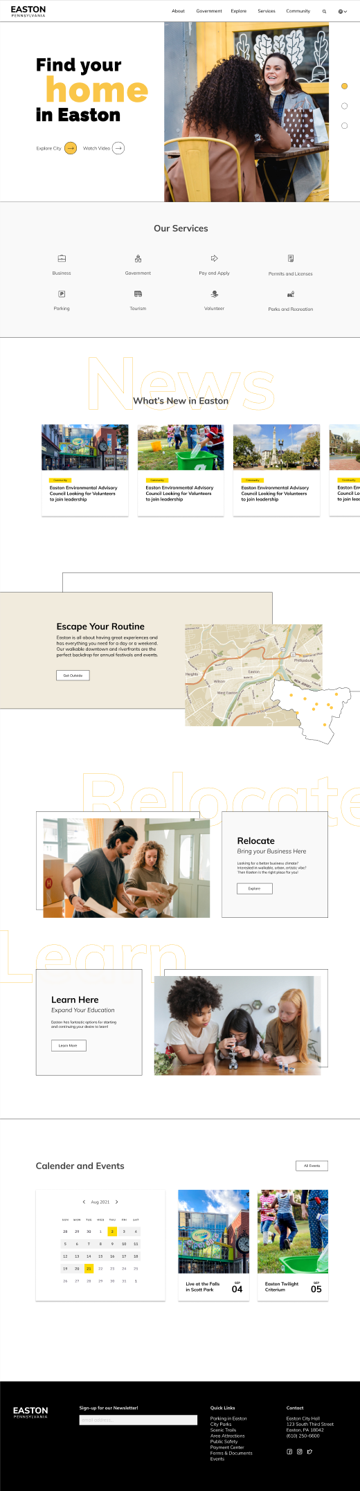
Event Page with V3 Home Page
Event Detail Page with V3 Home Page
For the event page, I incorporated a card system event
calendar with filters for effectiveness instead of having a
whole compacted calendar which overwhelms users.
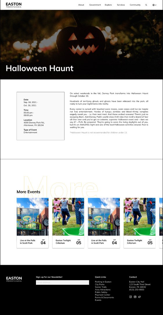
For the event detail page, I designed for the user to check out
more events without moving to another page while viewing the
details of an event. However, the event description section
looked flat, static, and wordy, so I decided to reorganize
elements, use icons, and apply the new mood and style.
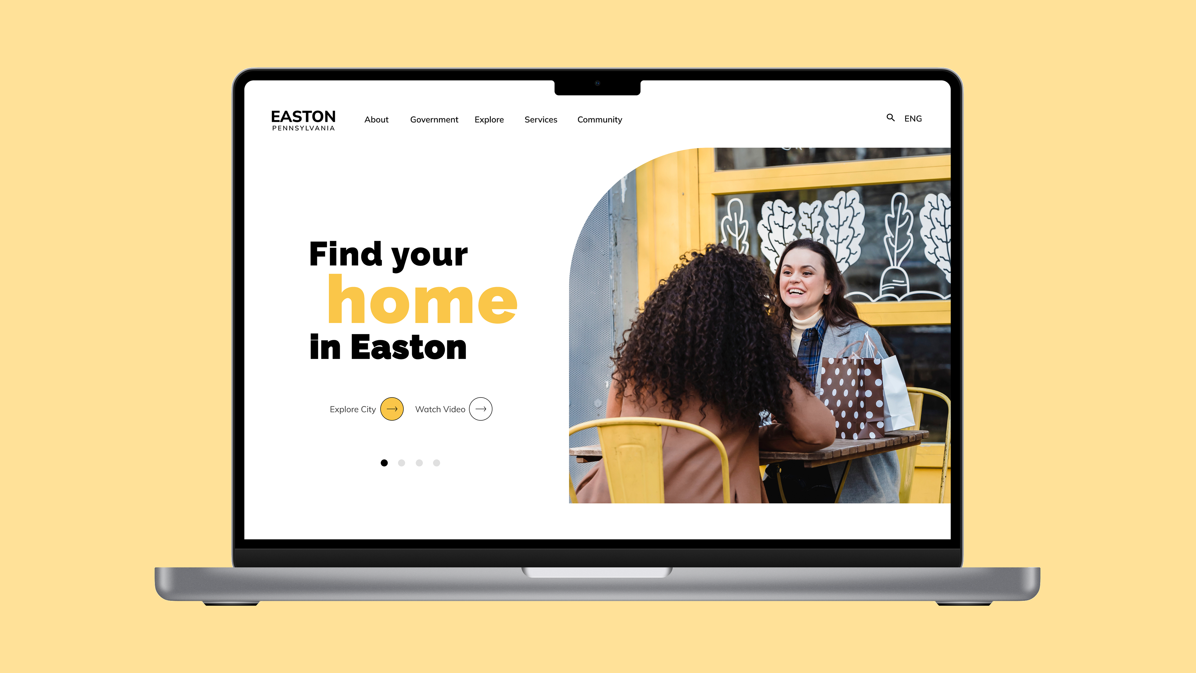
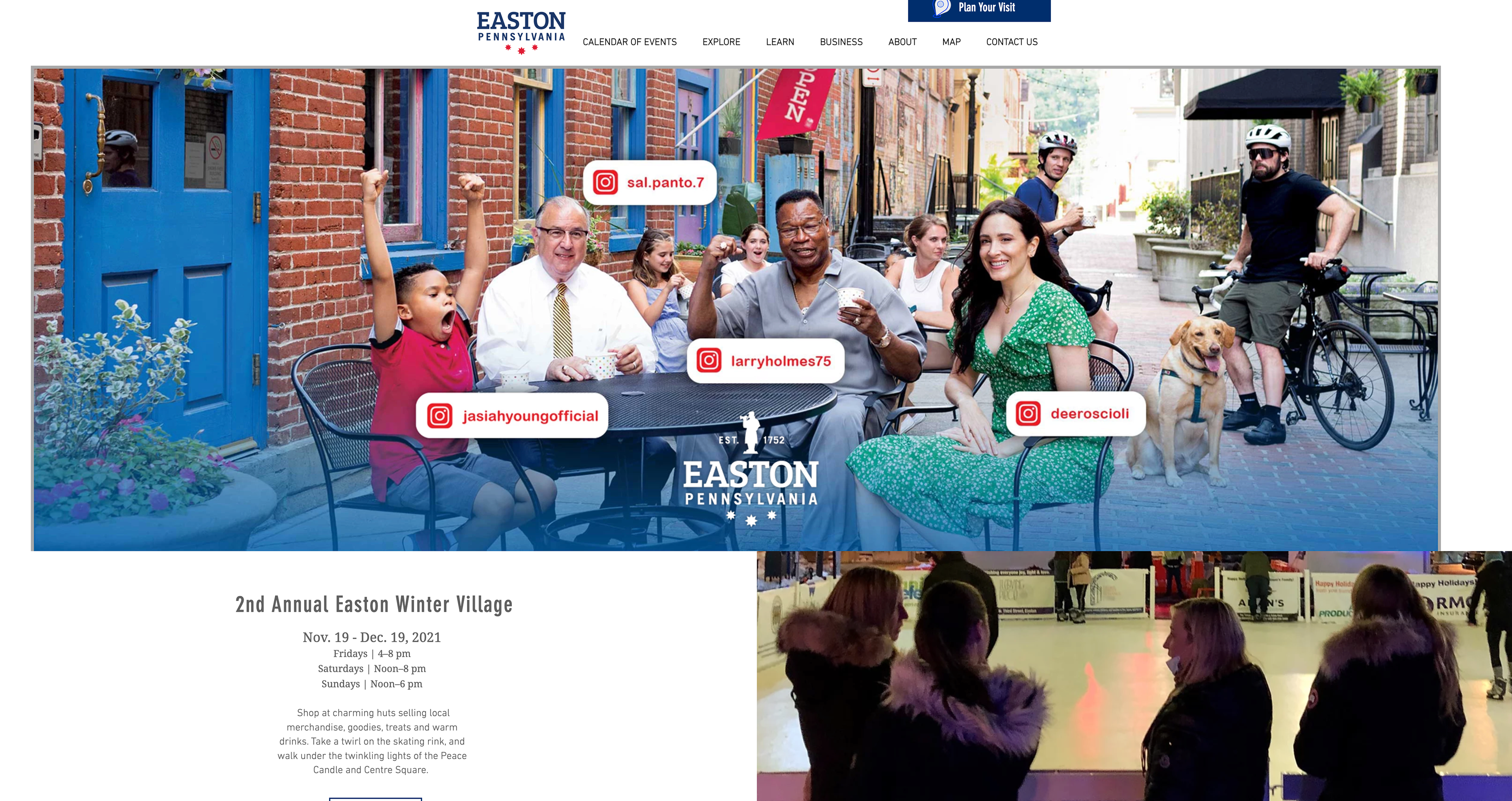
Final Design
final design
Animated prototype
Takeaways
During this project, I have developed my skill to
explore visual designs and the functionality of
a website further to build a concept that reflects
the city of Easton in the best way.
"What makes your website different from others?"
Throughout the design process, I also considered
the perspective of the client and the users, to
improve the design for the city identity, and
the user experience.

